
Case Studies
Website Redesign: The Craddock Group

Case Studies
Website Redesign: The Craddock Group
The Client
The Craddock Group is a service-disabled veteran-owned business that provides real estate and strategic planning solutions. They have been part of the development and implementation of strategic capital planning and public-private real estate solutions for multiple federal agencies, including the U.S. Departments of Veterans Affairs, Defense, Energy and Transportation and the General Services Administration, among others.
The Project
Brief
The client's expectation was to have the website rebuilt in a more accessible and easier platform, allowing its own employees to update it whenever they had a new case study, team member, or a hiring position available.
Besides migrating to a new platform, the client also required the design to be more modern, yet professional. Some of the website goals listed by the client were:
- Build trust and credibility with upcoming clients
- Support during hiring season
- Generate organic leads overtime
Goals & Challenges
The objective of this project was to improve the past site architecture, navigation, and design. The website needed to provide an easier and more visually pleasing browsing, helping users find relevant content easily.
Our main challenge was to implement a new efficient and dynamic design in a new platform, while still preserving the purpose of the original pages.
Key Deliverables
- Sitemap followed by a prototype designed in Adobe XD
- UX improvements and suggestions
- New responsive website user interface
Our Approach
The Process
The design approach we followed to develop this project was the Lean UX process. Since the timeline was restricted, this approach helped us reduce wasted time and resources, resulting in a workable product in a short amount of time. Since a Lean UX process requires a lot of iteration, as we built the product we kept researching and receiving feedback from the client in order to update and make revisions that would better fit the end user.
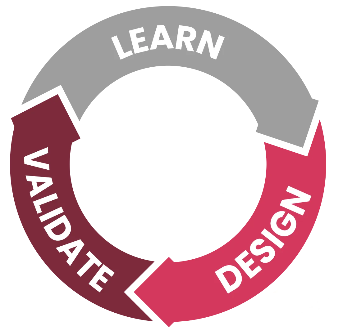
Detailed Process
Learn
- Client Interview
- Review of current website
- Competitor analysis and references
Design
- Redesign information architecture
- Design prototype built in Adobe XD
- Usability testing to validate the product internally
- Usability testing to validate the product with client
- Learn from user behavior
- Iterate
Validate
- Website development
- Test and evaluate the usability internally and with client
- Learn from user behavior
- Iterate
Project Delivery
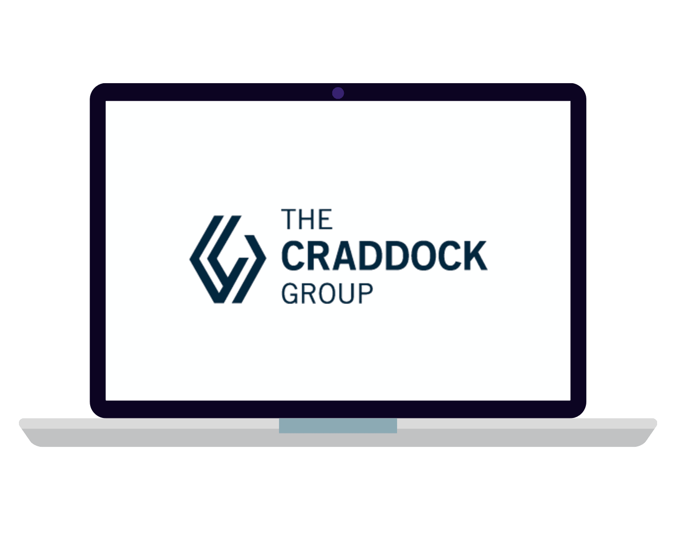
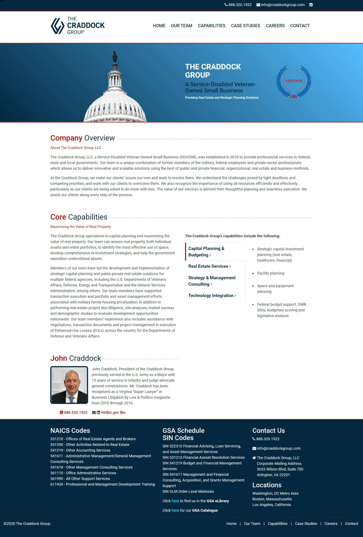
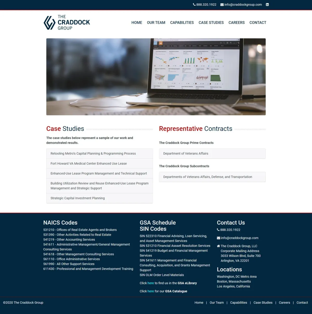
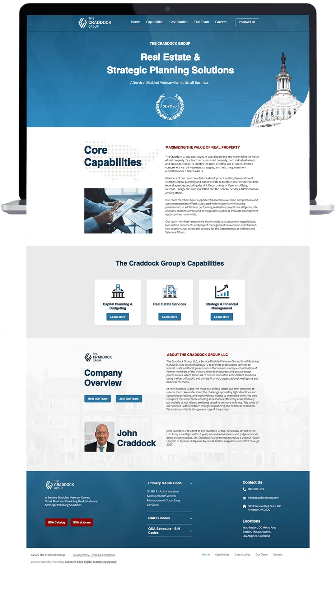
Website Overview
Key Findings: Potential Users
- Users interested in learning more about their services and previous case studies
- Users looking to apply for a job position
- New users that just landed on the page through organic search
Since the client's website has an institutional nature to it, we want it to be easier to navigate, showing efficiency and credibility.
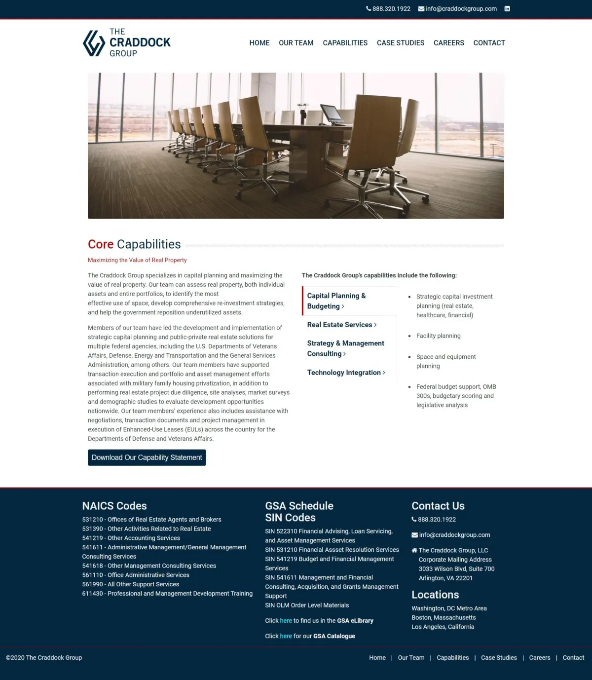
Key Findings: Products
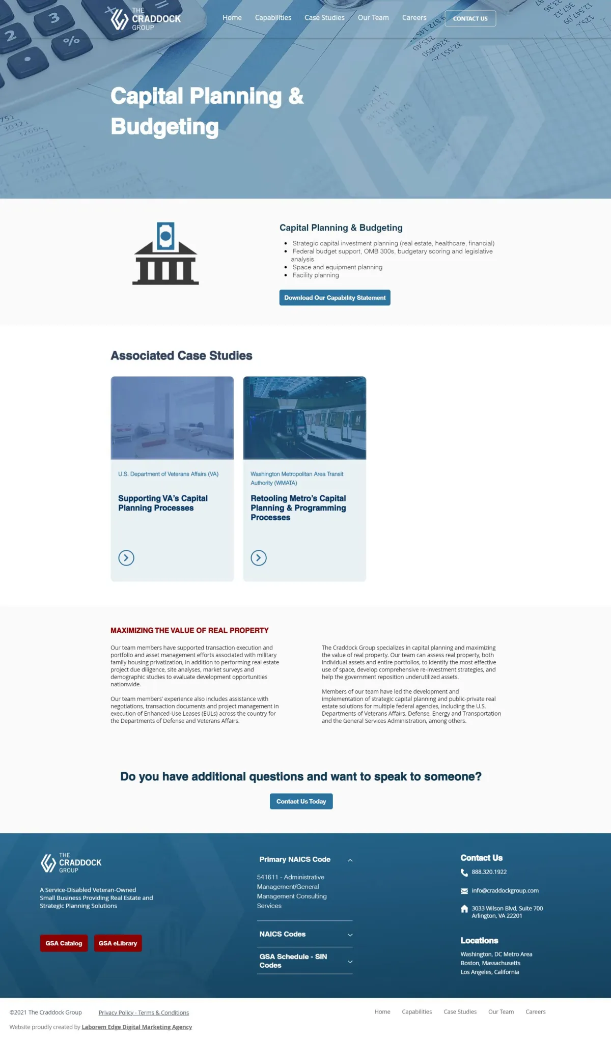
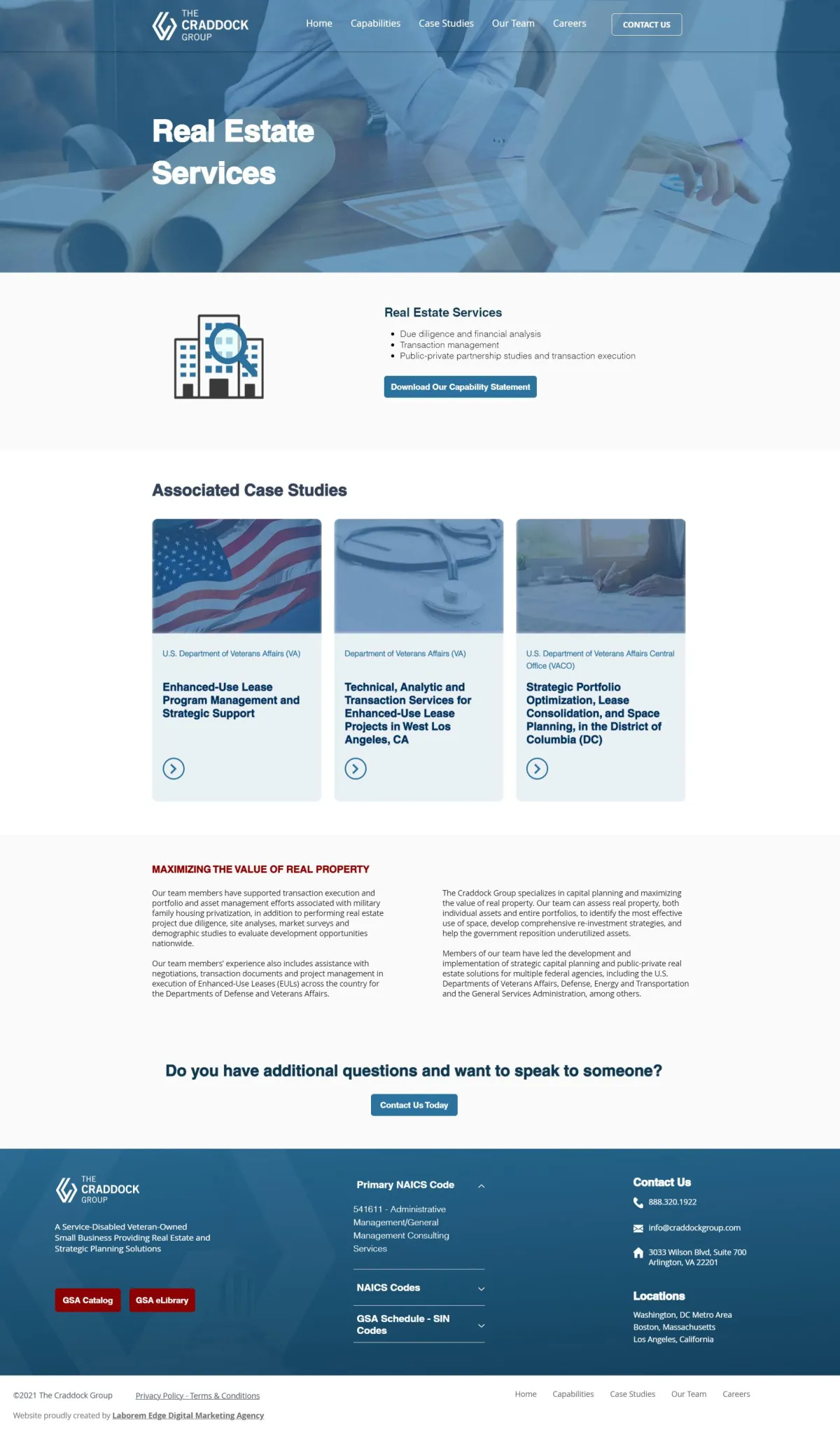
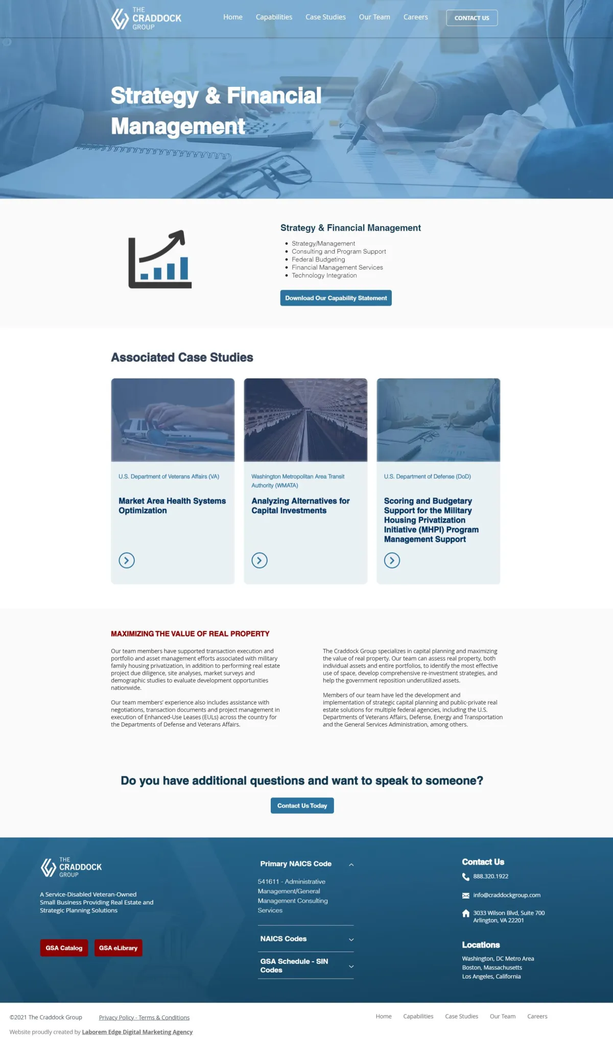
The Craddock Group offers three main core capabilities: Capital Planning & Budgeting, Real Estate Services, and Strategy & Financial Management.
Their approach to each service is best showcased by visiting each capability page and their respective case study. Therefore, the importance of implementing dynamic content, that way each capability page is automatically updated with its associated case study every time a new one is added to the site.
Previous Website
- Dense website as a whole with a lot of text blocks, no visuals, and a plain white background
- Few navigation links, which forced users to either go all the way to the top of the page or all the way to the bottom of the page to reach the menu
- Users had restricted access to more information related to the services the client offers
- There were few-to-no interactive resources for users to access
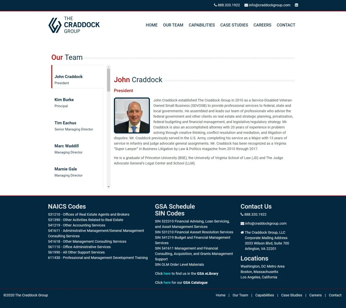
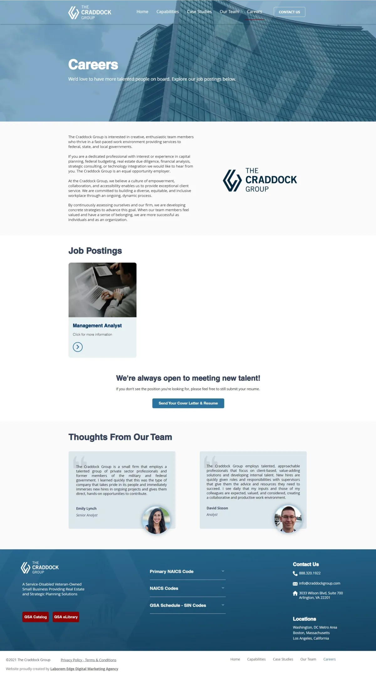
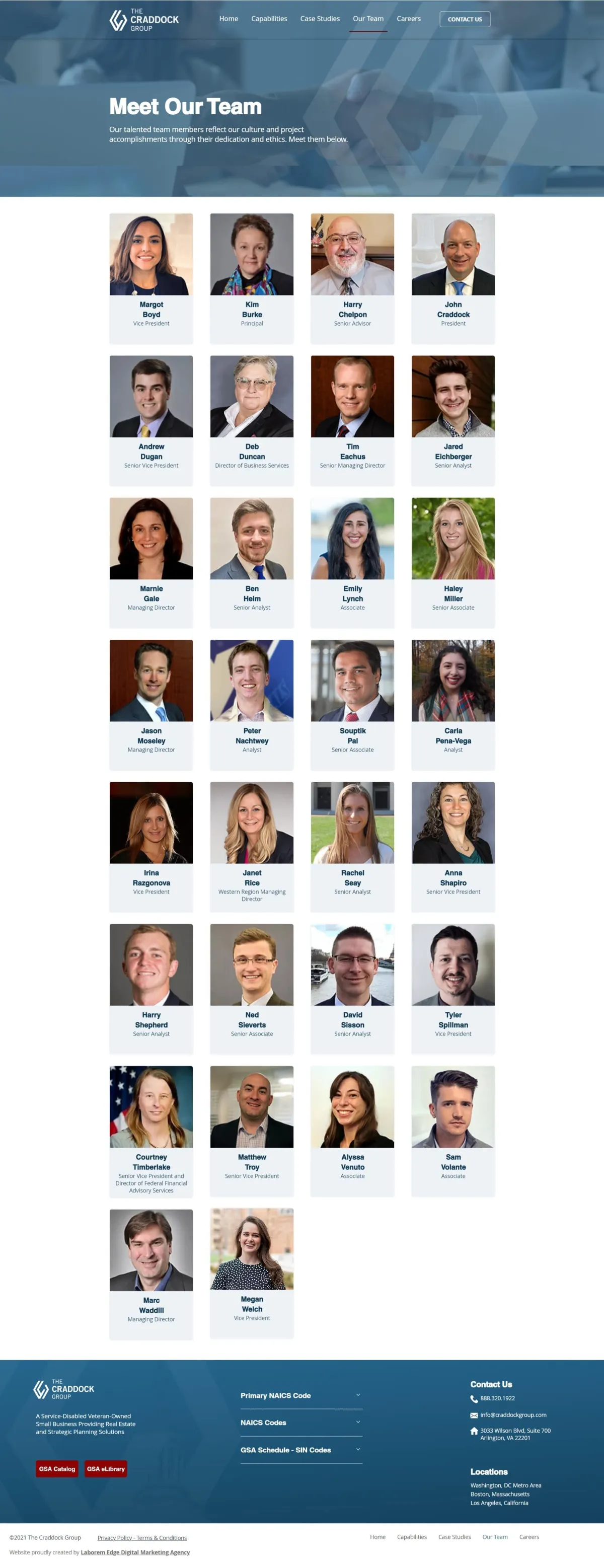
- The "Our Team" page hid all employees below the first five people and was not inviting enough for users to keep scrolling down
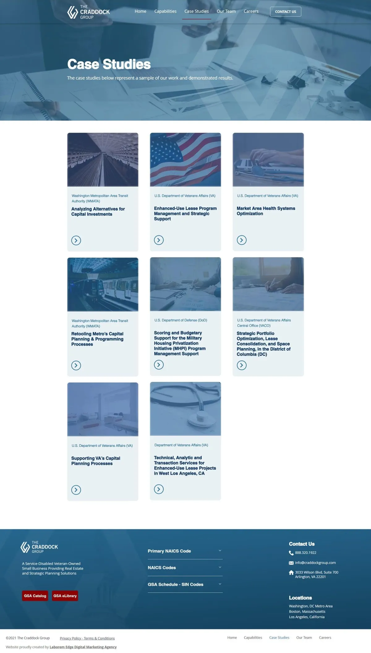
- The "Case Studies" page was formed by paragraphs with no clear divided sections
- The platform was too complex to allow employees to make updates
- The mobile version had responsiveness issues, negatively affecting the user experience
Redesign
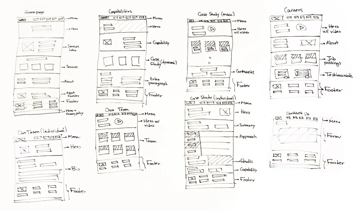
Wireframe: Low Fidelity
Wireframes were made to put the initial design ideas for the main pages into place before we dived into the prototype that was developed through Adobe UX.
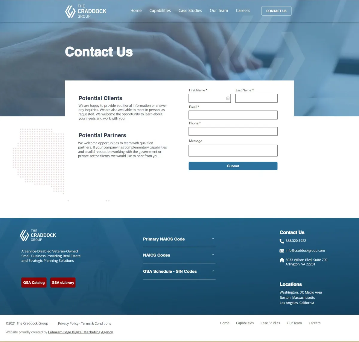
Final Screens
Testimonial From Client
"Last year, we were fortunate to be referred to Laborem Edge when we were ready to redesign our old WordPress web site. We needed a fresh and modern look for our online presence, and the old site was not up to that task. George, John, and Amanda spent several hours working with us to arrive at the look we had in mind (but couldn’t articulate), and then they patiently worked with us on the content.
Due to client responsibilities, we sometimes had difficulty staying on schedule for our deliverables to them, but they were flexible and patient with us.
Now, we have a great looking site with fresh and updated content; plus, we can do minor updates ourselves. When we have a question about making certain changes, Amanda is super-responsive and eager to help. She also takes a teaching approach to her answers, and that helps us going forward.
We were not looking for a site that generates leads or attracts hits; nevertheless, our online presence is a crucial piece of our overall reputation in our industry. Laborem Edge understood our needs and purpose, and they helped us achieve them."

Deb Ducan
Director of Business Services
Did you enjoy this case study?
Don’t miss a thing!
Sign up for our newsletter


Did you enjoy this case study?
Don’t miss a thing!
Sign up for our newsletter
Schedule Your Free Consultation


© 2022 Laborem Edge, LLC. All Rights Reserved.